Burn Down Charts Suck. For me any way. The frustration is that they abstracting away the real picture of the progress into a single line.
A Burn Down Chart is “a graphical representation of work left to do versus time”*. Let’s take a look at one.
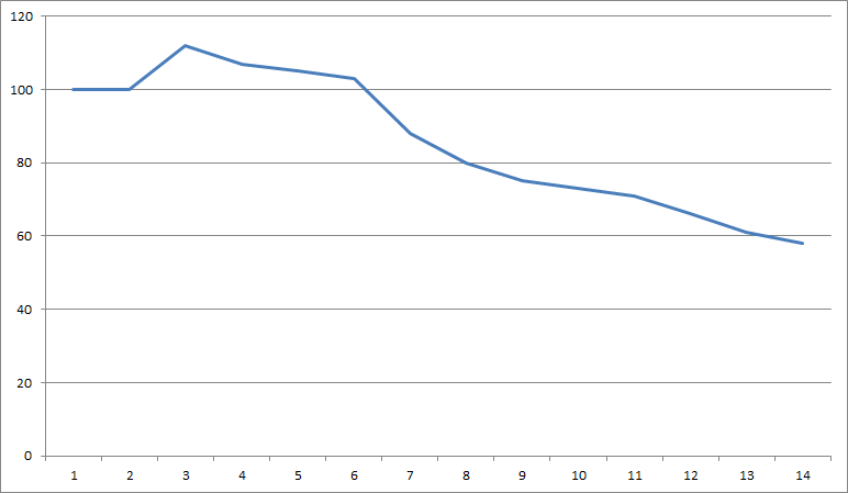
What is happening here? It looks right, the trend is downward which is good and progress seems to have been good over the last few days. At the start Day 1 there is 100 units of work to do and by day 14 – we are down to 58.
However, what happened on day 2? Why did it go Up when its a Burn Down chart. Well that’s obvious, the scope increased for some reason. OK so the scope increased to 112 units of work. Well actually it didn’t. The Burn Down chart is hiding the fact that there was a scope increase of 20% to 120 and that there were 8 units of work completed. At a glance – you cannot see that detail, your team cannot see it and your stakeholders cannot see it.
Day 7 is another good example. That’s a great day. 15 units of work completed, right? Well, actually No. The burn down chart again fails to highlight that there was a fluctuation in the scope. This time a reduction from the removal of 10 unnecessary units of work. Add that to the 5 units of work completed and its a pretty big drop.
My preference is for the Burn Up chart. This is the equivalent of the above Burn Down. The scope is red and the cumulative work completed the purple.
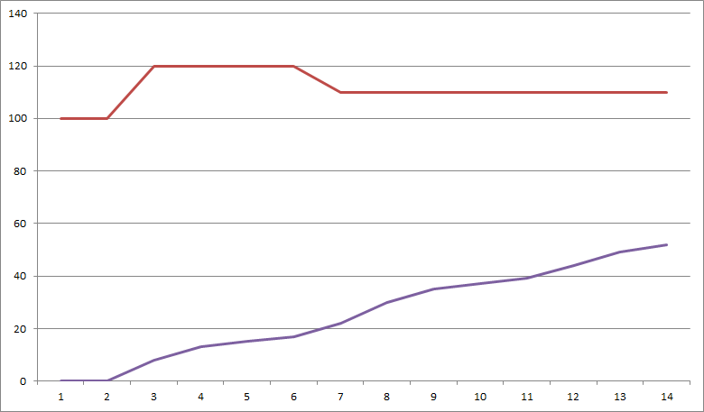
It still performs the same task – providing a graphical representation of work left against time. Rather than chasing 0 you are ticking off the work done and rising to meet the target.
It also provides a lot more detail at a glance. The fluctuations in scope are by far and away the most obvious win here. It is clear to see that the target has moved and it becomes an easy talking point. Particularly in Day 7 when this could easily be missed in the Burn Down chart. It also provides a graphical representation of the actual momentum/velocity of the team. In this example it is very steady progress. The team hit their stride and were ticking of units of work at a reasonable velocity. Scope changes could easily mask this in the burn down chart so it’s much clearer in this chart.
There is an argument that scope should never fluctuate and that everything should be so well defined that we know where we will be. Unfortunately that might be the case in a lab or training environment, but in reality, scope changes, particularly in an environment that is fast paced and changing. And we should embrace that change.
Realistically though, both charts have their place. And producing the two from the same data is really easy. However if you have space for 1 chart at your stand up or in your stakeholder sprint review slide deck make sure its the one that gives the full picture, not part of the story – the Burn Up chart.
Chart Data:
| Day | 1 | 2 | 3 | 4 | 5 | 6 | 7 | 8 | 9 | 10 | 11 | 12 | 13 | 14 |
| TotalScope | 100 | 100 | 120 | 120 | 120 | 120 | 110 | 110 | 110 | 110 | 110 | 110 | 110 | 110 |
| Done | 0 | 0 | 8 | 5 | 2 | 2 | 5 | 8 | 5 | 2 | 2 | 5 | 5 | 3 |
| Cumulative Done | 0 | 0 | 8 | 13 | 15 | 17 | 22 | 30 | 35 | 37 | 39 | 44 | 49 | 52 |
| Work Left | 100 | 100 | 112 | 107 | 105 | 103 | 88 | 80 | 75 | 73 | 71 | 66 | 61 | 58 |
